
ABOUT THE PROJECT
Victory is one of Israel’s largest supermarket chains, expanding into Tel Aviv through its “Victory CITY” urban format.
As part of this expansion, the brand initiated a design collaboration inviting designers to create a reusable tote bag
that reflects a recognizable moment from the city.
The project explores how a functional retail object translates Tel Aviv’s urban identity into a clear and scalable graphic system.
CHALLENGE
Design a tote bag that captures Tel Aviv’s identity without relying on clichés,
while functioning as both a practical retail object and a culturally meaningful statement.
DESIGN APPROACH
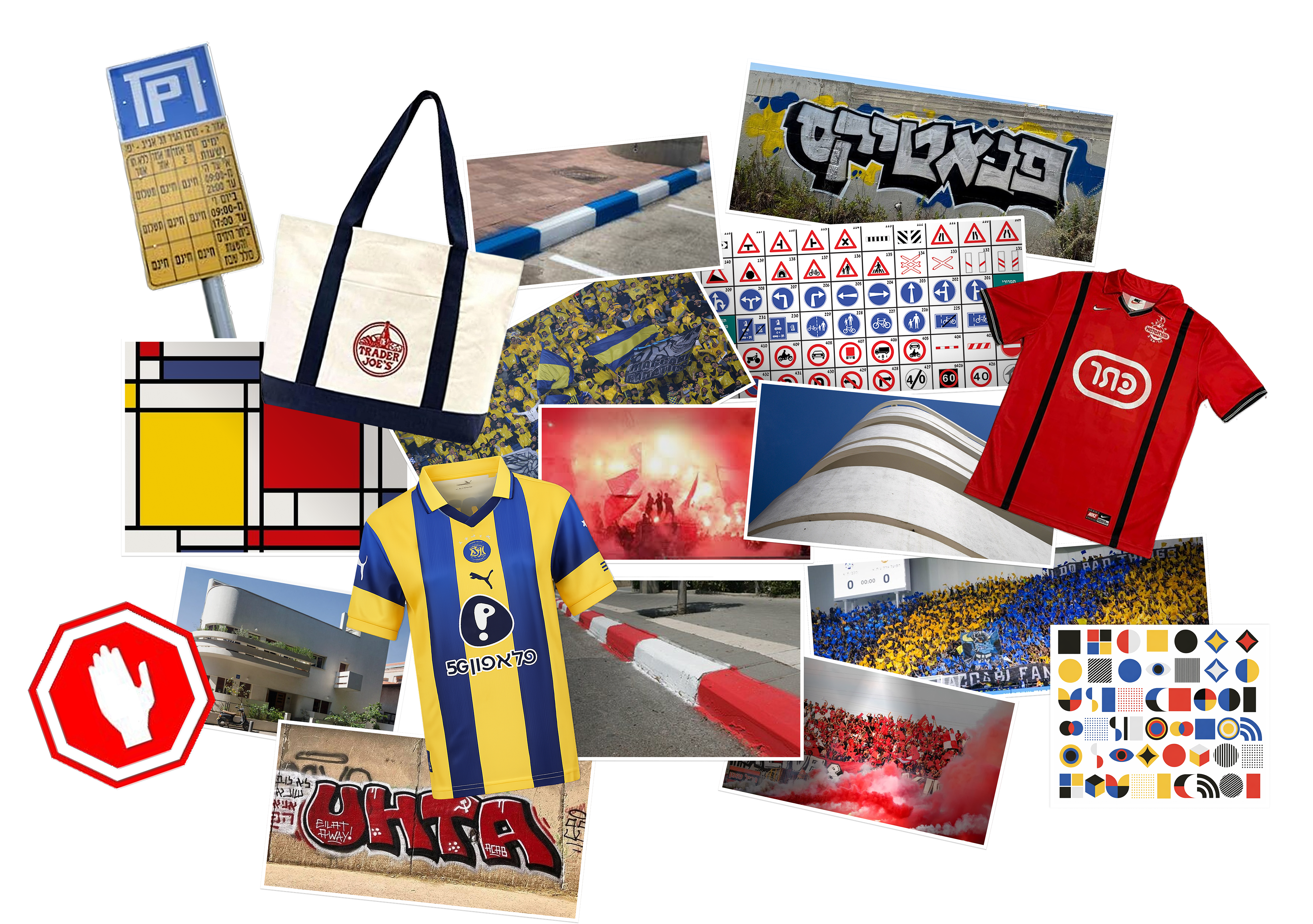
Mood Board
Tel Aviv is defined by contrast - rivalry and coexistence, order and spontaneity, structure and expression.
Rather than reducing the city to a single visual direction, the project explores two parallel systems,
each translating a different layer of urban culture.
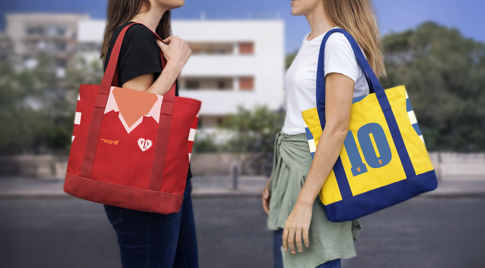
CONCEPT 1: Two rival identities unified through a shared visual system
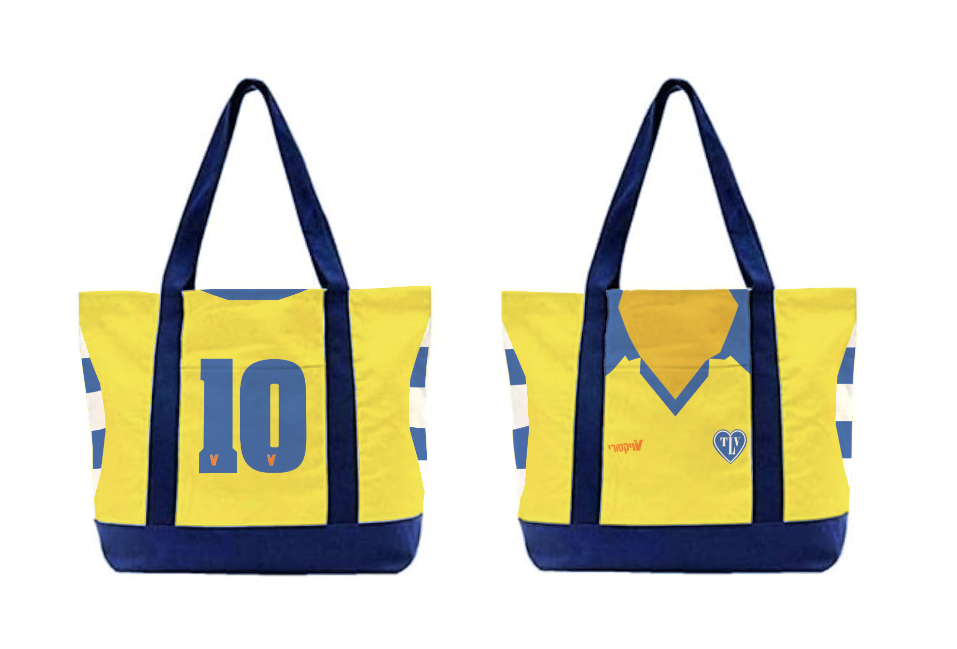
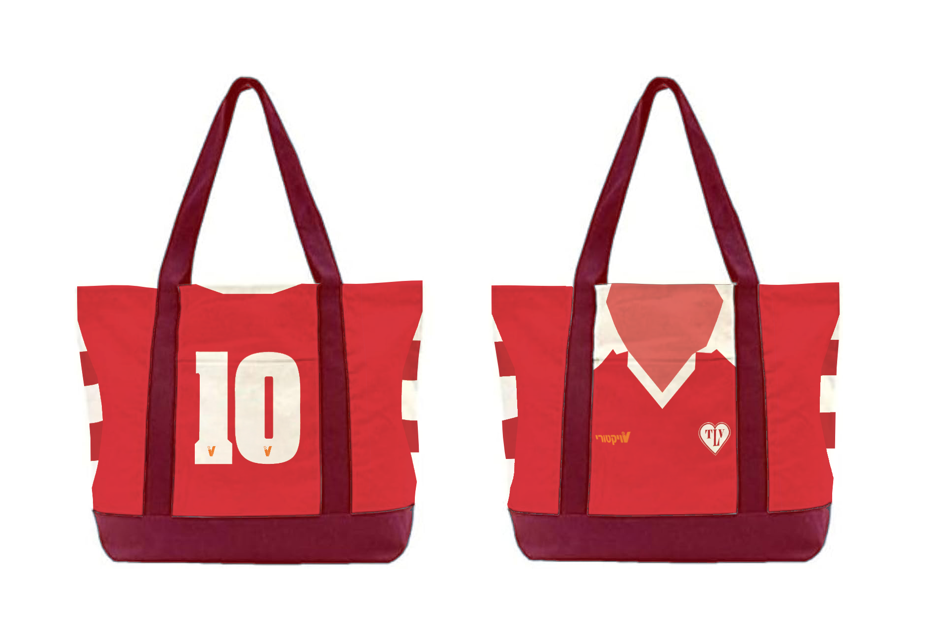
Final Design - Front & Back (Concept 1)
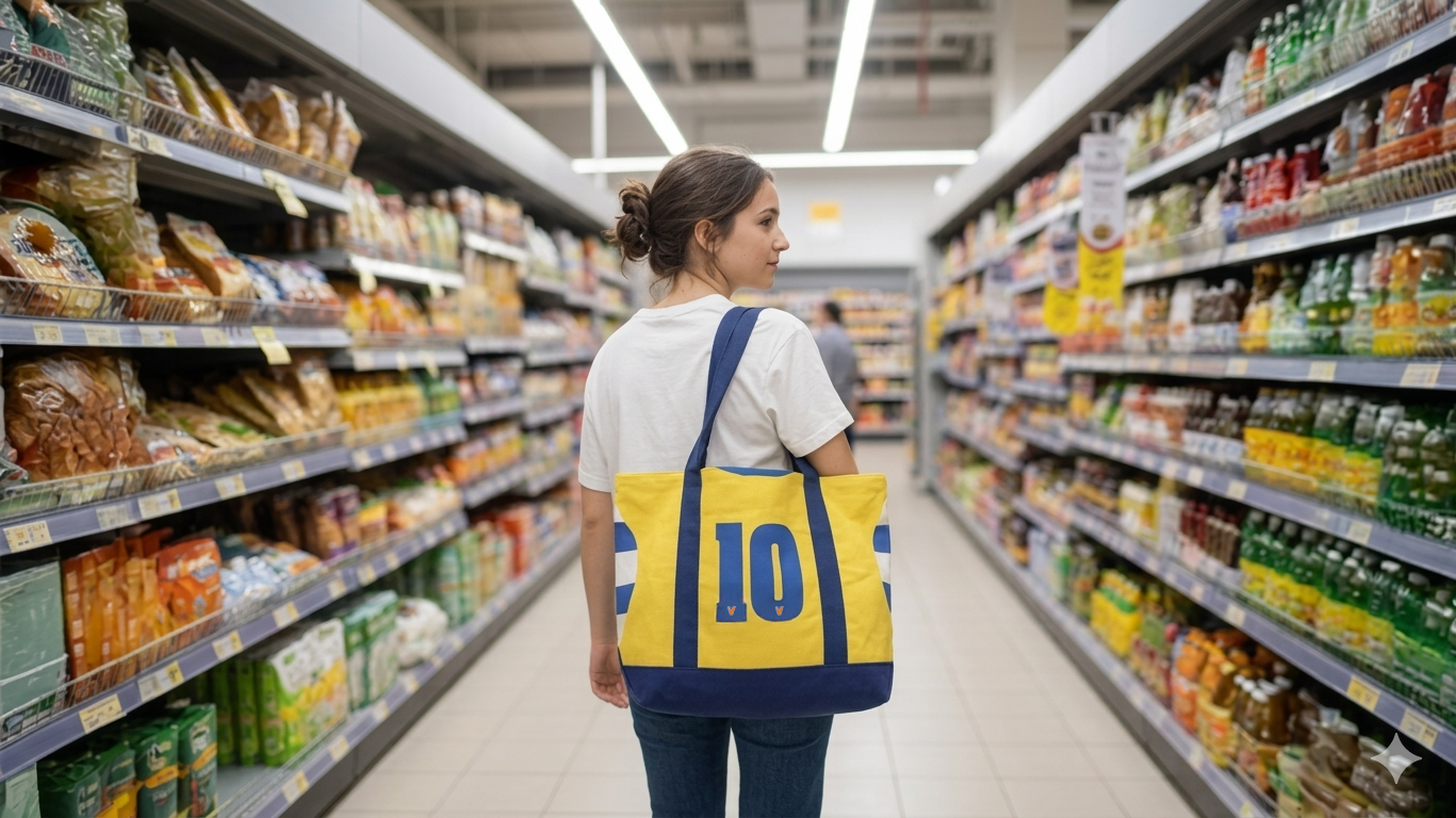
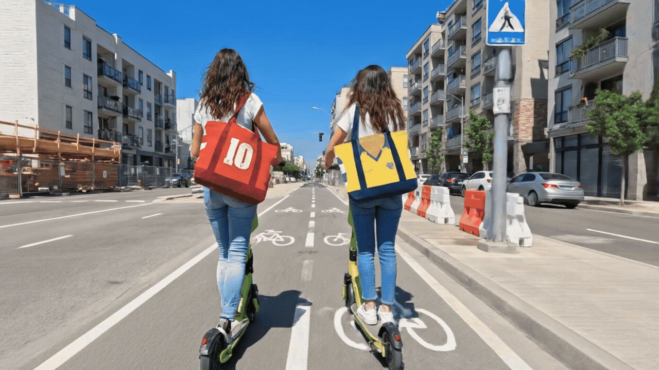
The rivalry between Hapoel (red) and Maccabi (yellow) forms a visible and emotional layer of Tel Aviv’s identity.
This concept translates that tension into two tote editions inspired by football jersey structures - using color, silhouette,
and graphic logic without relying on official insignia.
When viewed together, red and yellow conceptually merge into Victory’s brand orange - positioning the brand
as a shared meeting point within the city.
DESIGN SYSTEM
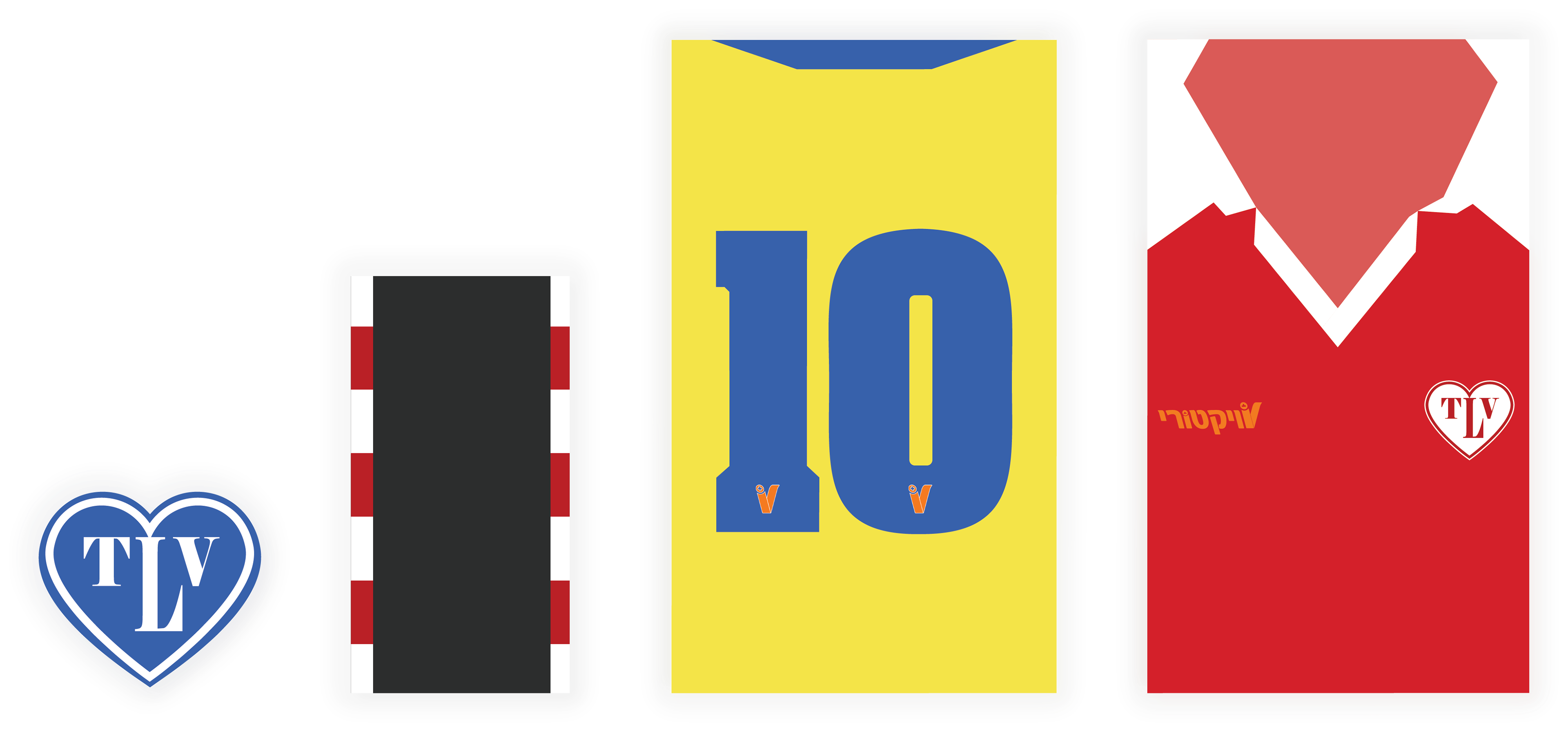
Design System - Close-ups
The system is constructed from modular elements derived from both sports culture and the urban environment.
Jersey silhouettes, a unified TLV emblem, numeric markers, and references to curb markings operate within a consistent visual logic.
Rather than isolated graphics, these elements operate as a cohesive system translating rivalry into a shared urban language.
STRUCTURAL LAYOUT
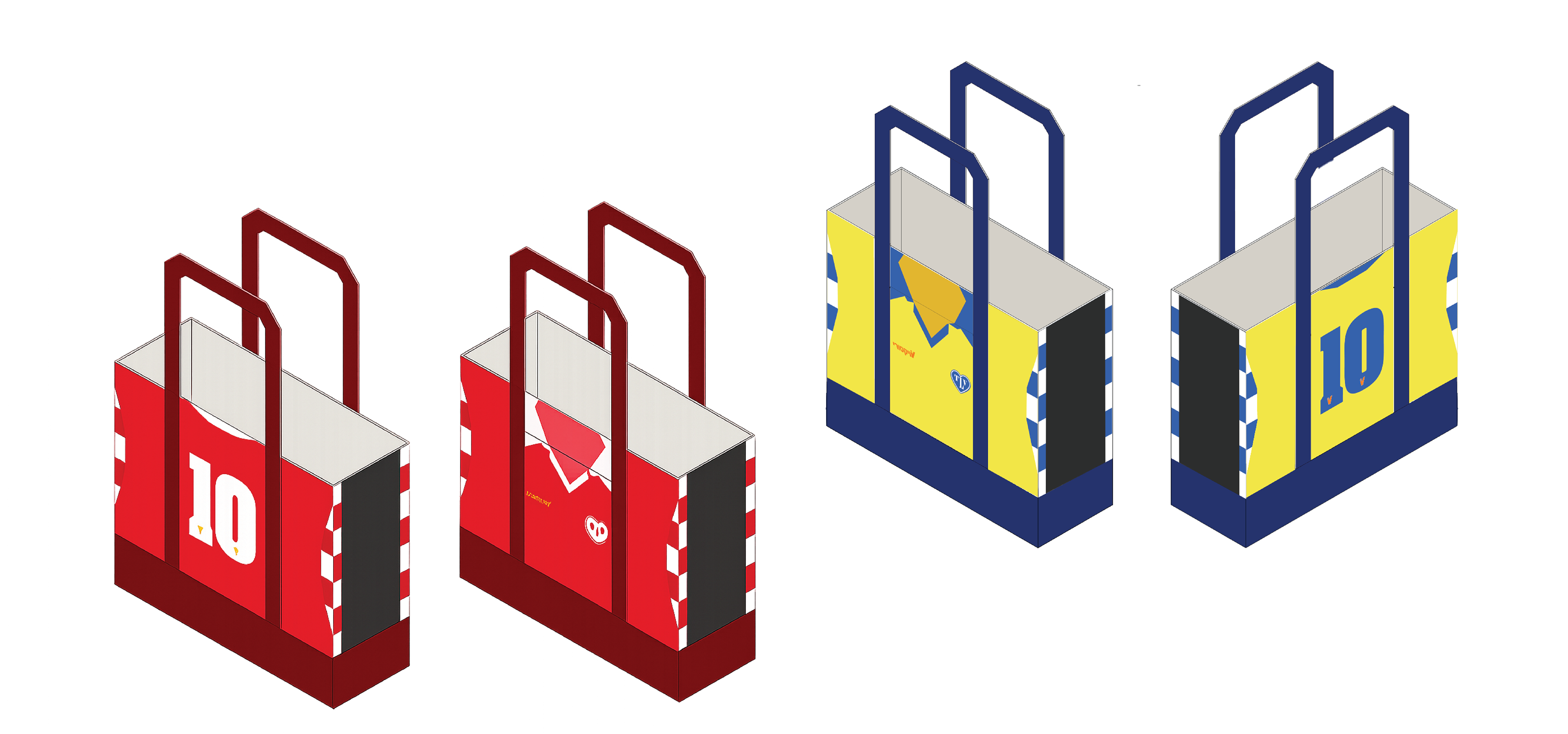
Layout Simulation (Concept 1)
The design is constructed as a continuous graphic system, unfolding across the bag’s surfaces
and maintaining visual continuity in three dimensions, ensuring clarity and cohesion.
TAG DESIGN
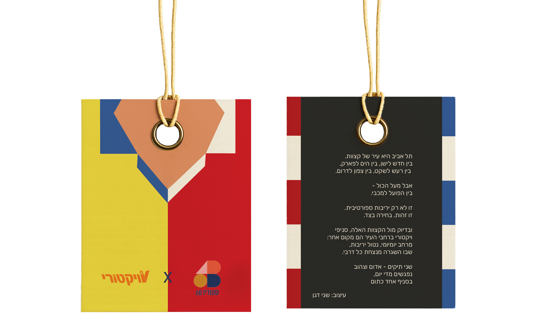
Information Tag - Front & Back (Concept 2)
The tag extends the concept through concise storytelling, reinforcing the connection between product, city,
and brand while maintaining a clear and balanced visual language.
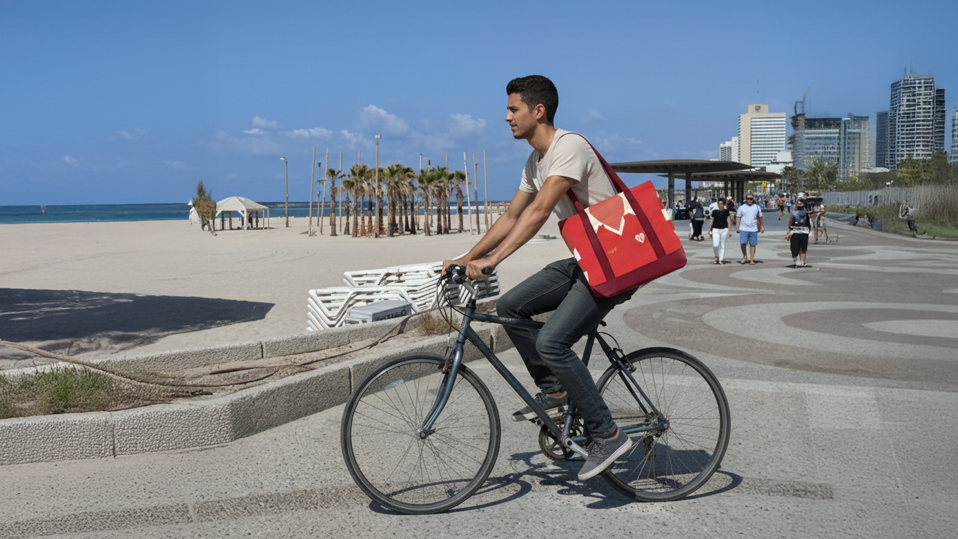
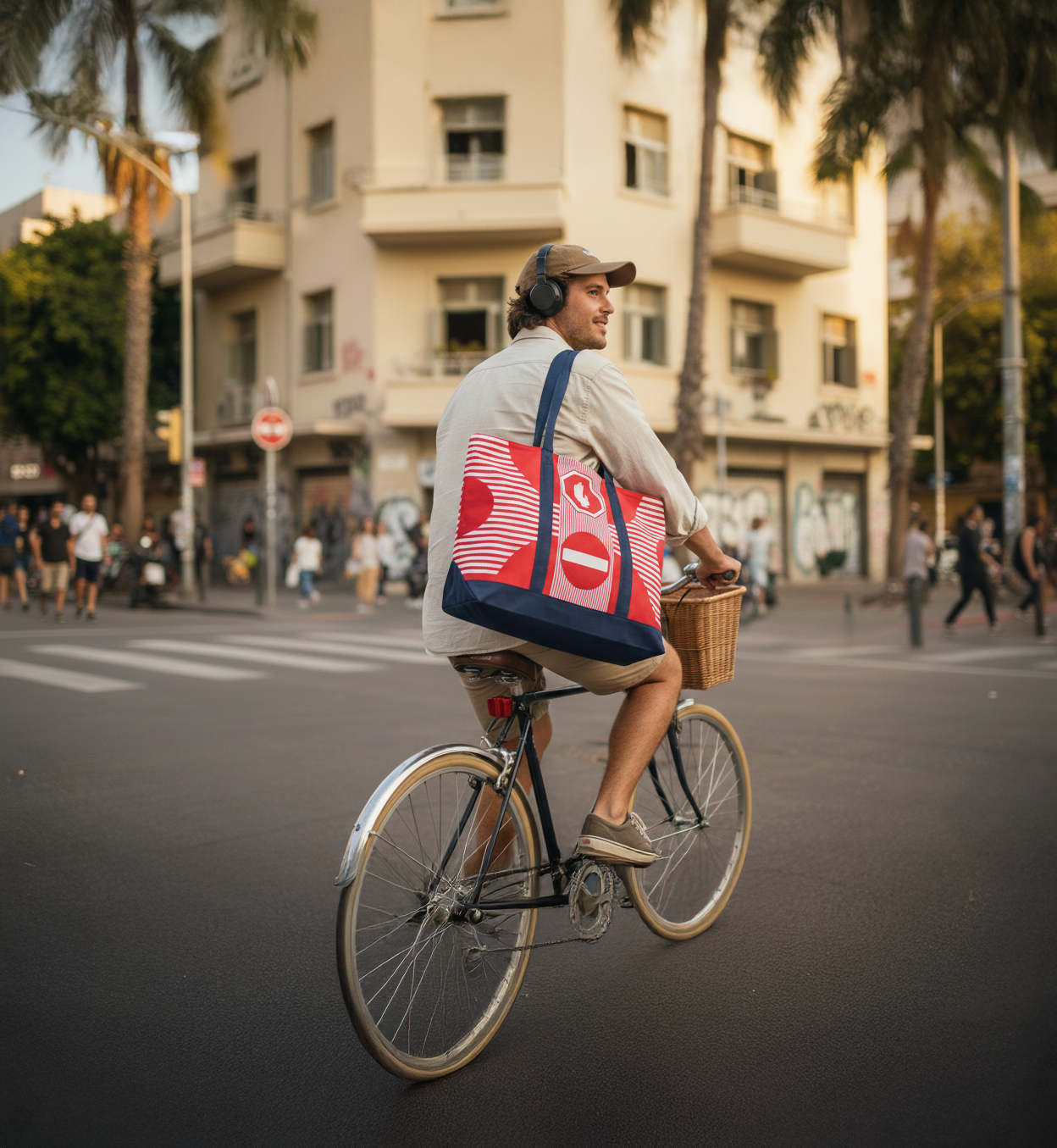
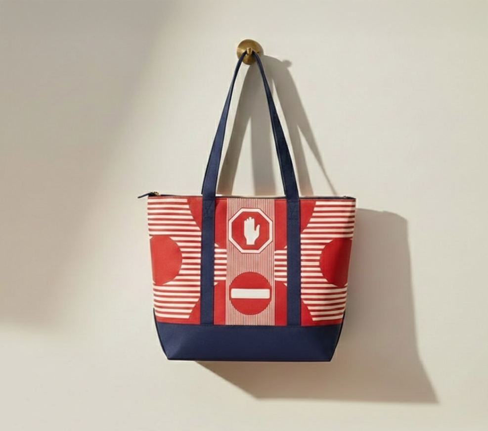
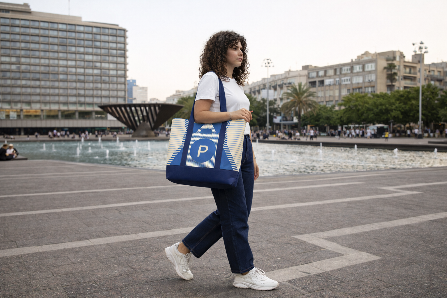
SYSTEM IN USE
CONCEPT 2: Urban communication as a visual syste
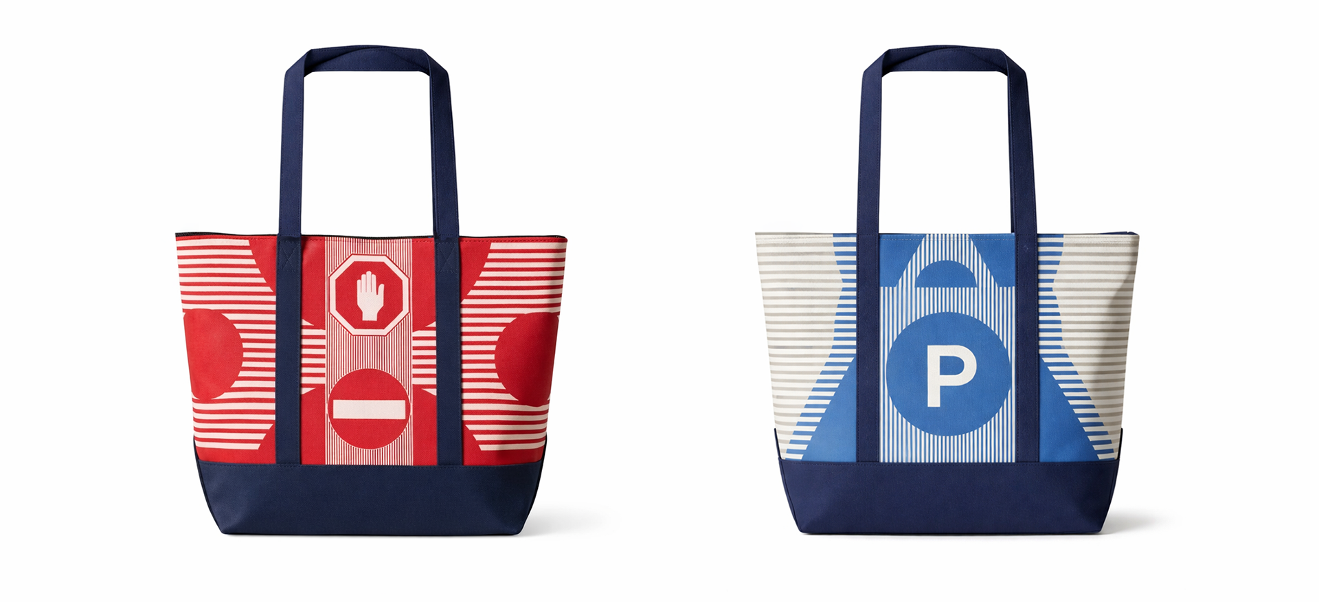
Final Design - Front & Back (Concept 2)
In Tel Aviv, parking operates as an informal communication system between drivers.
This concept transforms the tote into a functional urban signal.
One side displays a “P” symbol indicating availability, while the reverse references a stop sign signaling the opposite.
VISUAL LANGUAGE
The visual language draws from Bauhaus modernism, strongly associated with Tel Aviv’s architectural identity.
Grid, primary colors, and controlled composition guide the design. The tote operates as both object and message.
STRUCTURAL LAYOUT
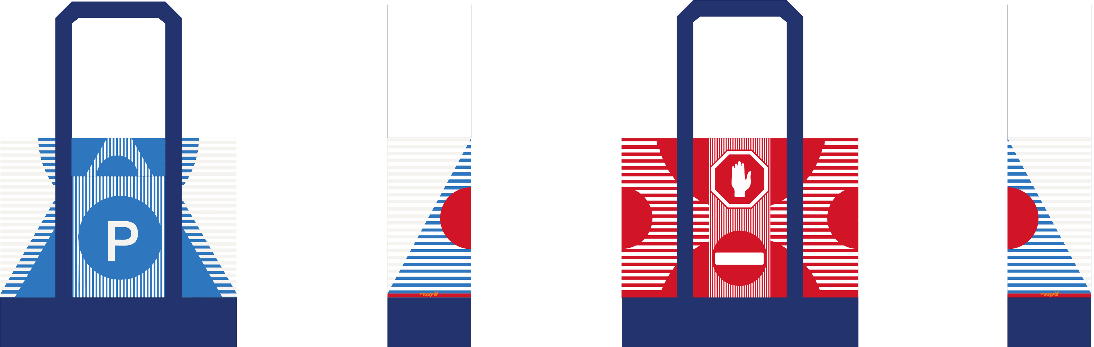
Final Design - Layout (Concept 2)
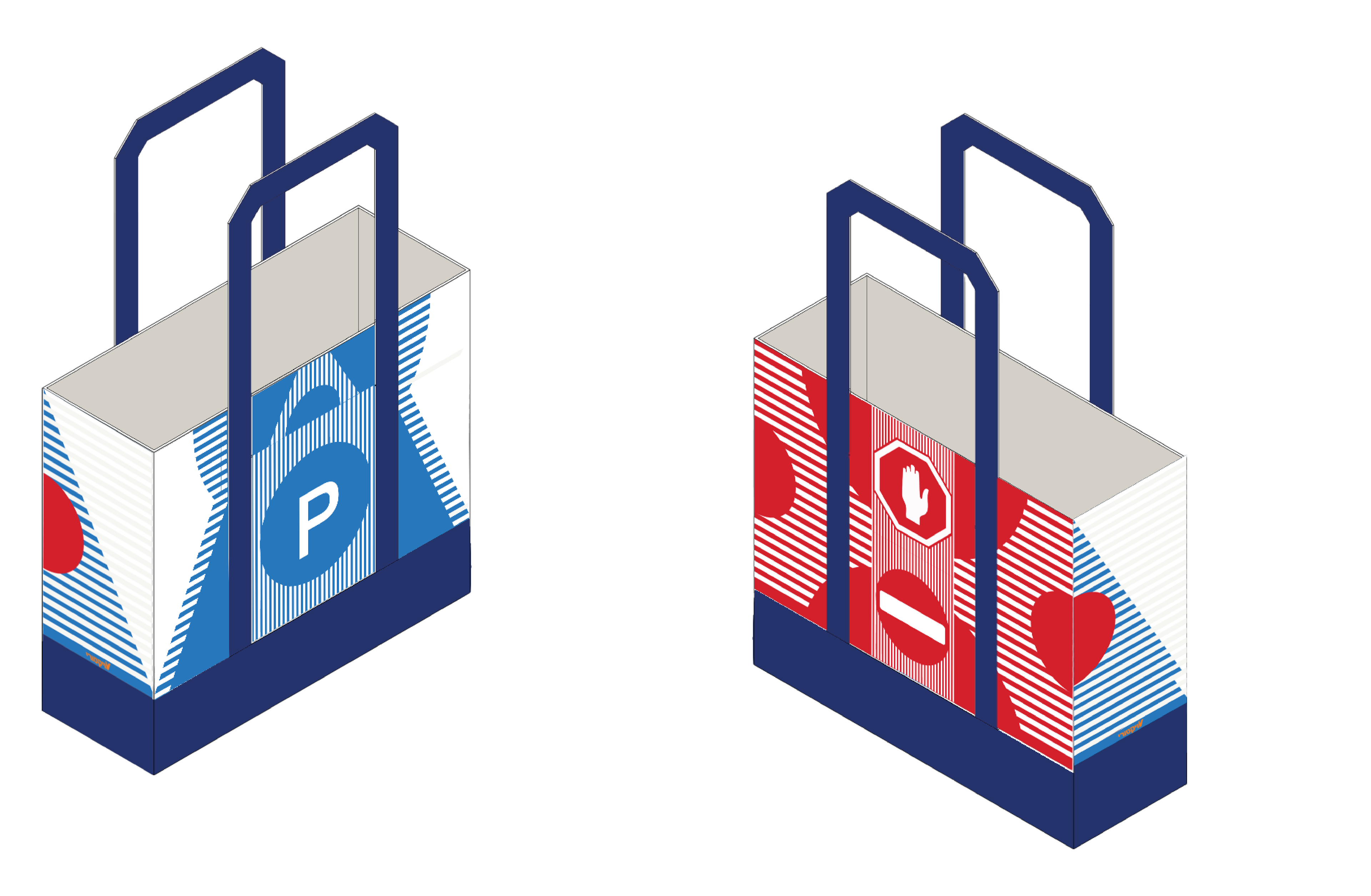
Final Design - Layout Simulation (Concept 2)
The layout is designed as a continuous wrap, allowing the graphic elements to adapt seamlessly across the bag’s structure,
ensuring visual continuity and maintaining clarity across all surfaces.
TAG DESIGN
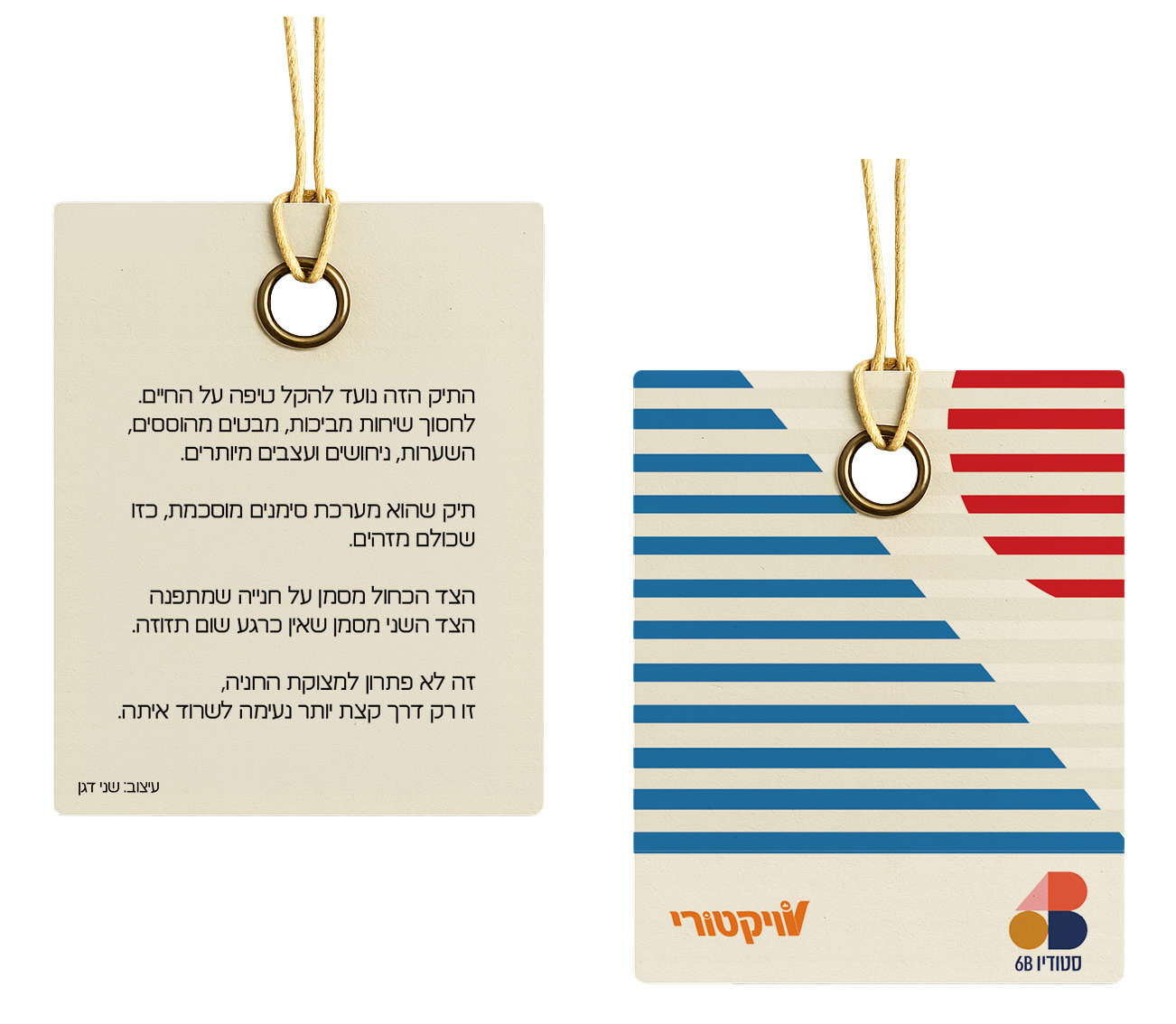
Information Tag - Front & Back (Concept 2)
The tag reinforces the concept by connecting the product to the urban environment it references.
SYSTEM IN USE
OUTCOME
The project presents two distinct systems for translating urban identity into a functional retail object.
One explores collective symbolism through color logic, while the other examines urban communication through modernist structure.
Together, they demonstrate how everyday objects can embody local narratives through clear and scalable visual systems.
Urban Context Video