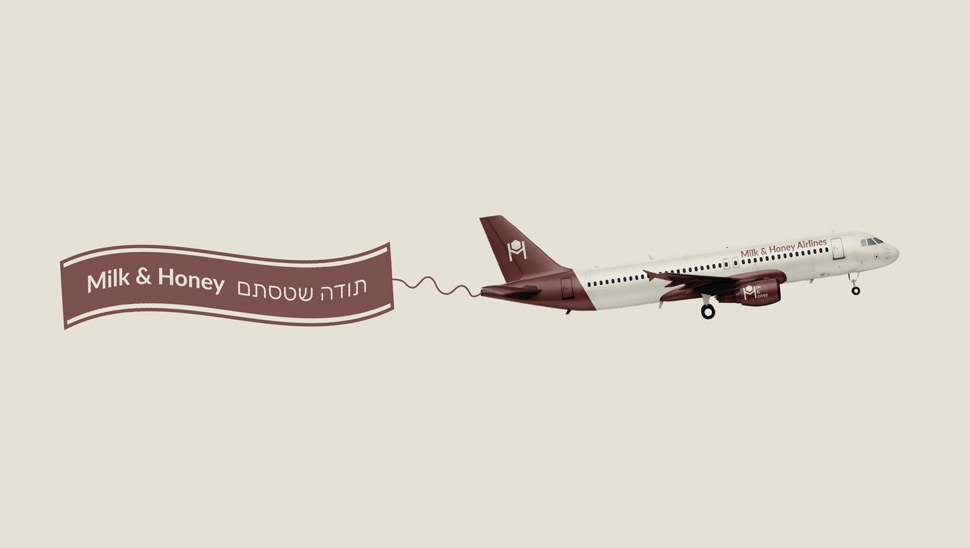

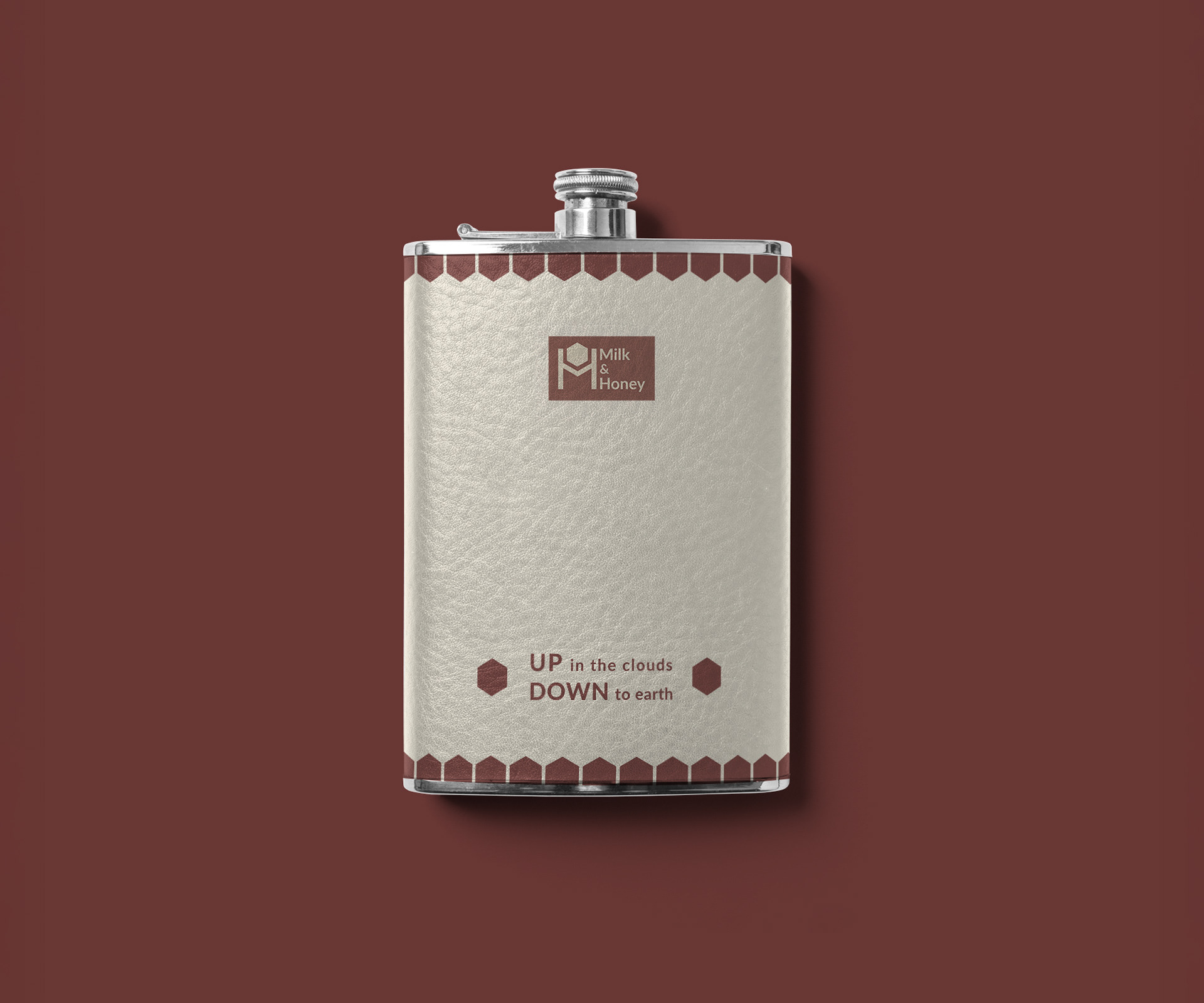
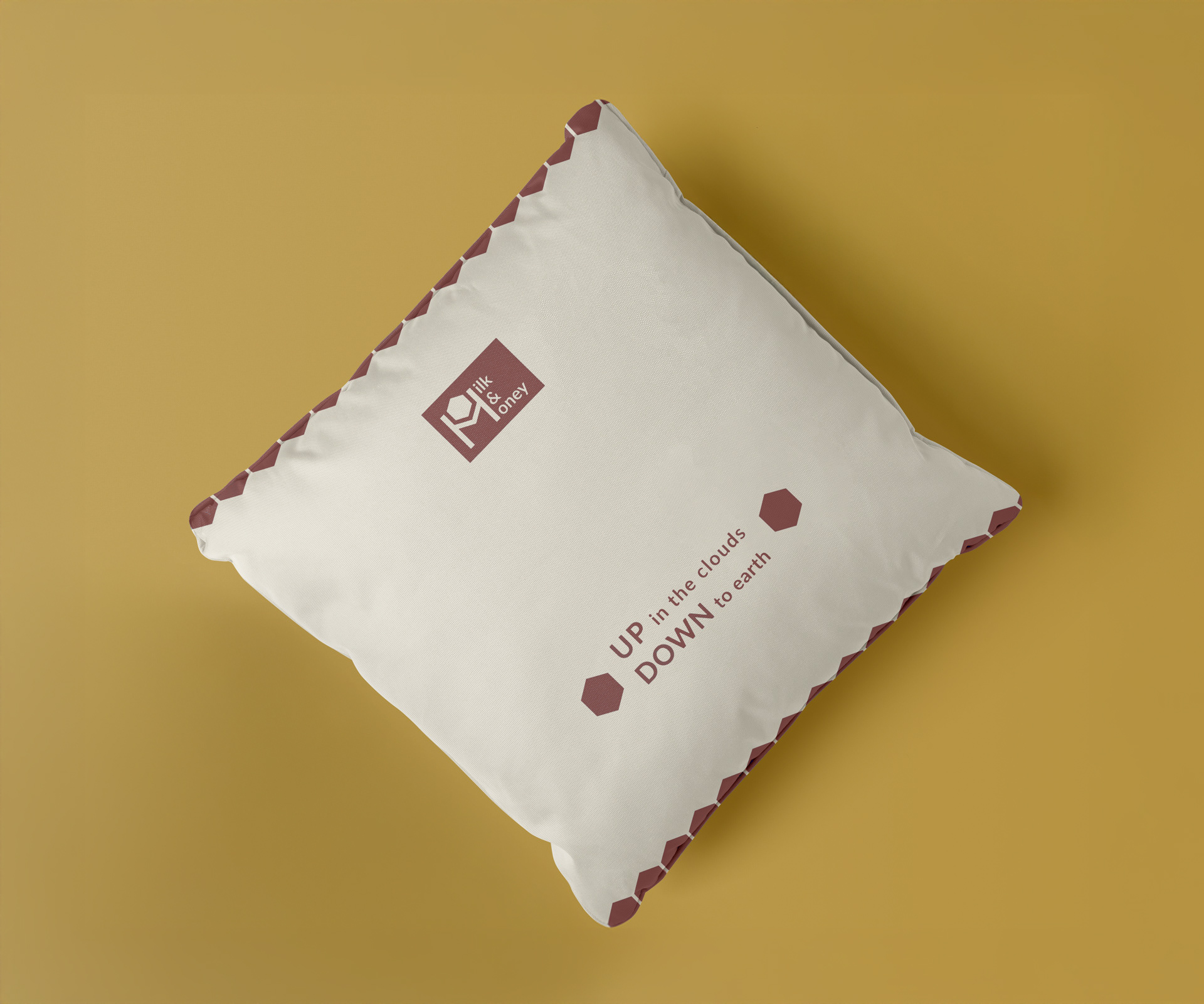
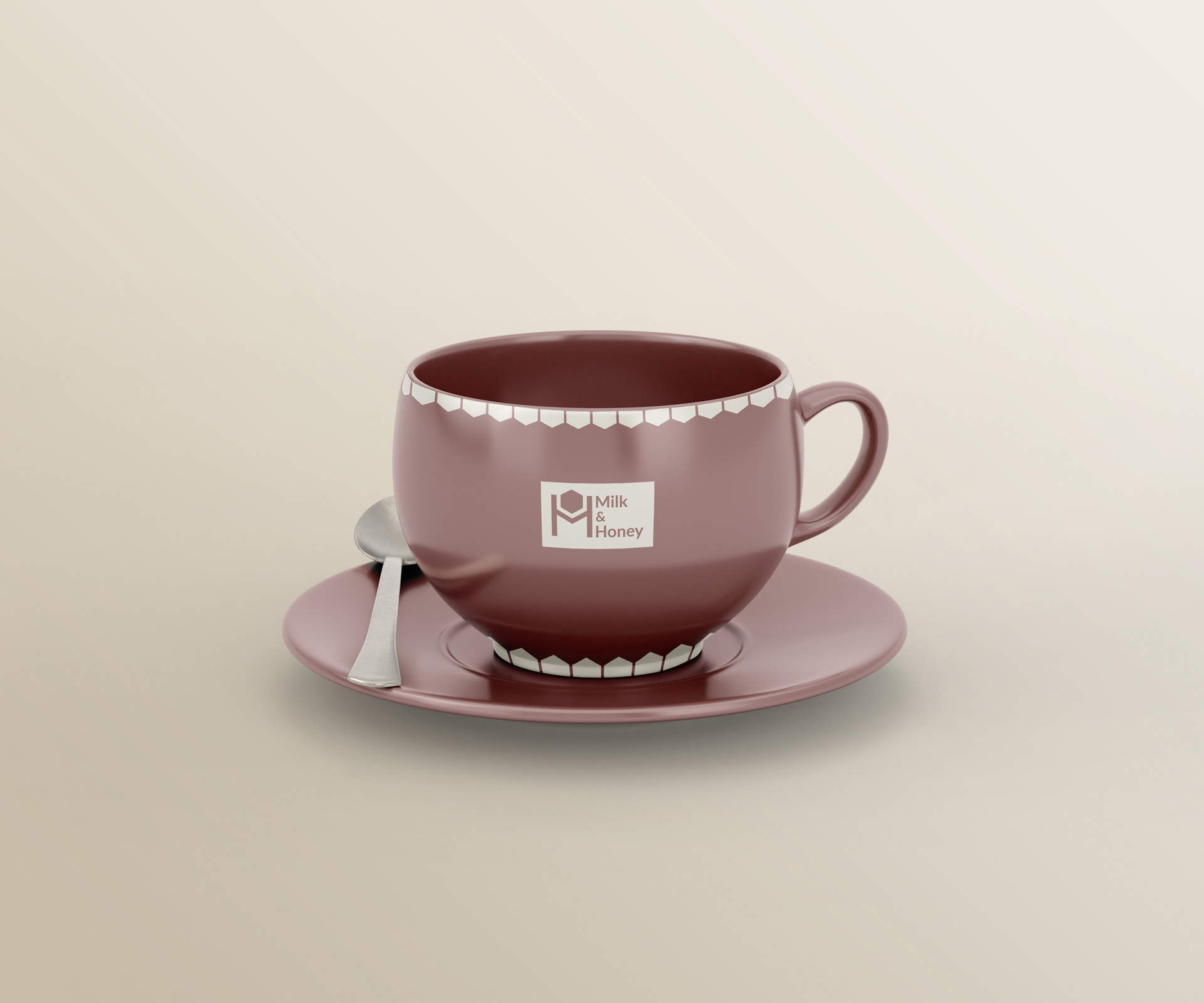
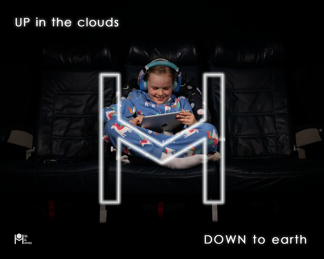
Milk & Honey Airlines is a new Israeli airline offering a flight experience defined by precision and attention to detail - blending local identity with an international spirit.
The brand appeals to an urban, mature audience that values quality service, thoughtful design, and genuine comfort. It embodies the idea of “down-to-earth elegance” - a journey that feels effortless yet refined. Its three core values - precision, groundedness, and understated elegance - guide every aspect of the brand, from its visual language to the passenger experience on board.
The brand appeals to an urban, mature audience that values quality service, thoughtful design, and genuine comfort. It embodies the idea of “down-to-earth elegance” - a journey that feels effortless yet refined. Its three core values - precision, groundedness, and understated elegance - guide every aspect of the brand, from its visual language to the passenger experience on board.
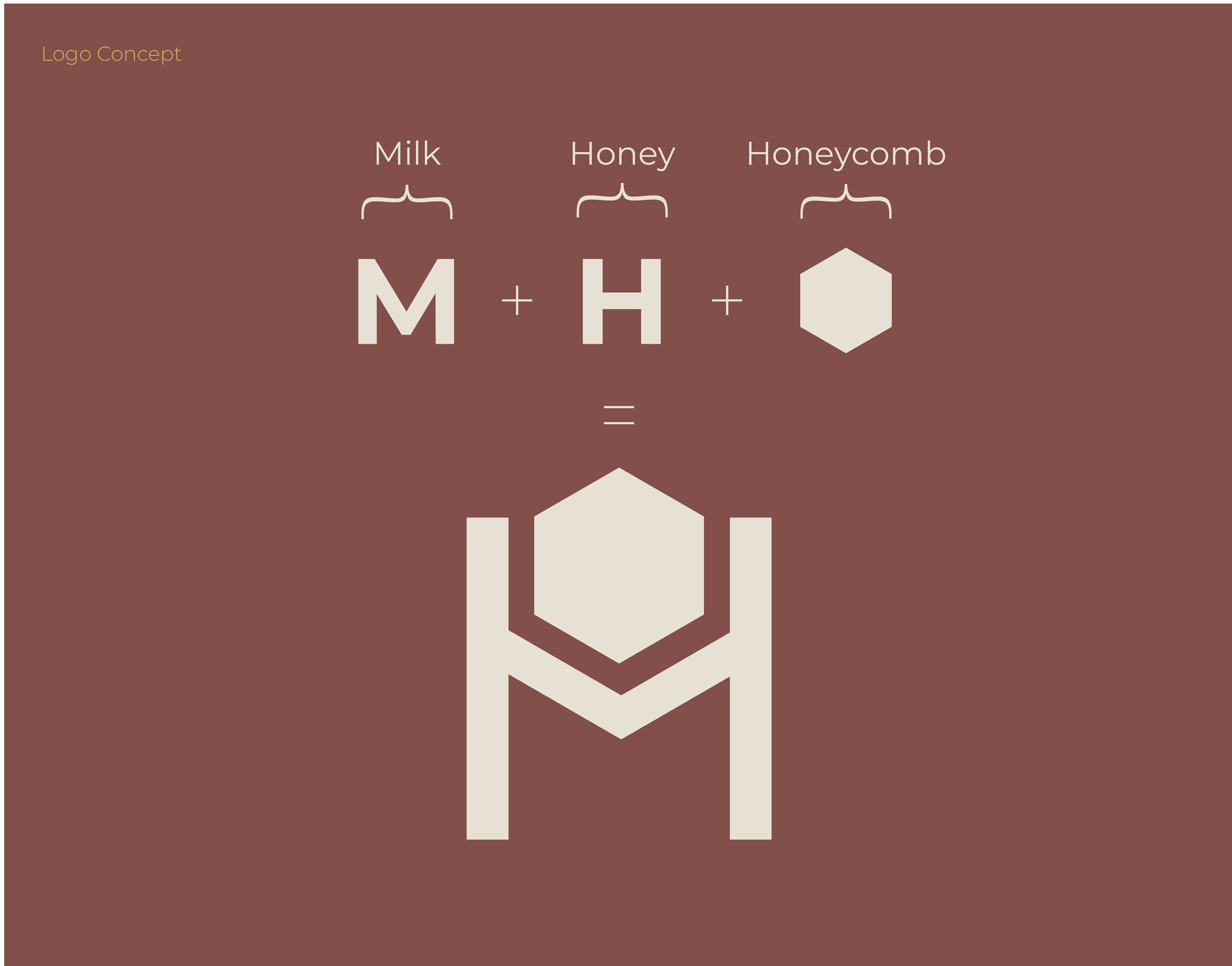
Concept & Visual Inspiration
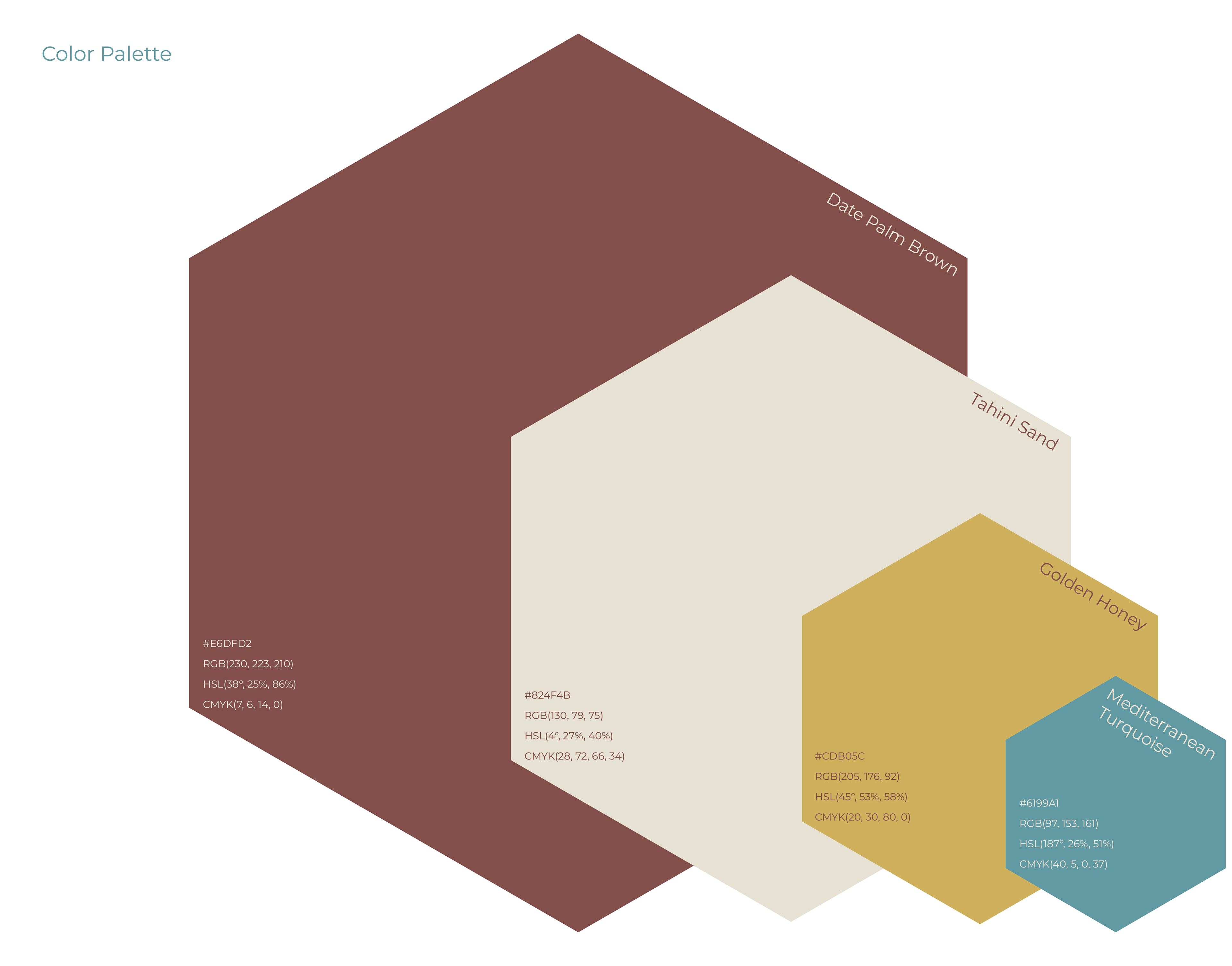
The visual identity of Milk & Honey Airlines was inspired by hand-painted floor tiles commonly found in classic Tel Aviv apartments.
These tiles reflect an urban, design-aware lifestyle - one that values elegance, simplicity, and quiet sophistication.
They embody a dialogue between past and present, ground and sky - a balance of nostalgia, precision, and grace.
From this inspiration came the logo, color palette, and graphic lines, forming a visual language that feels refined, cohesive, and distinctly Israeli.


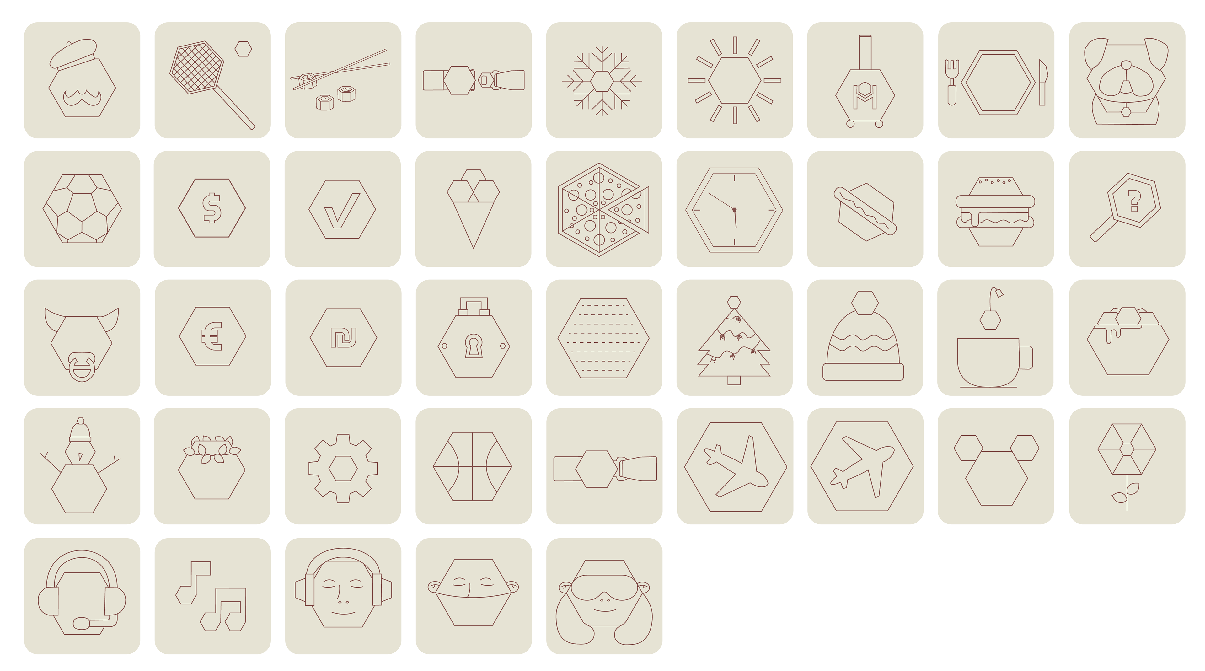
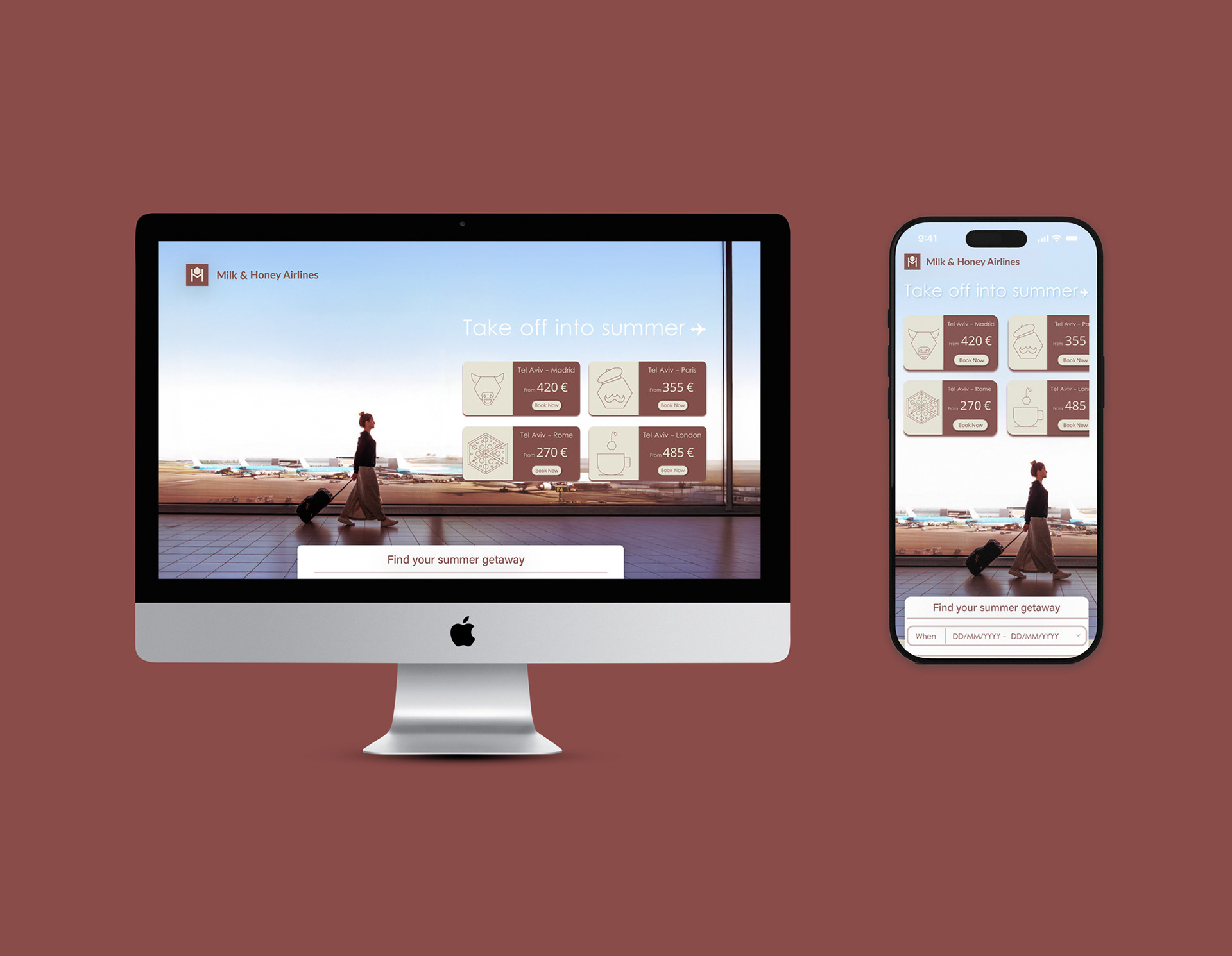
Icon system
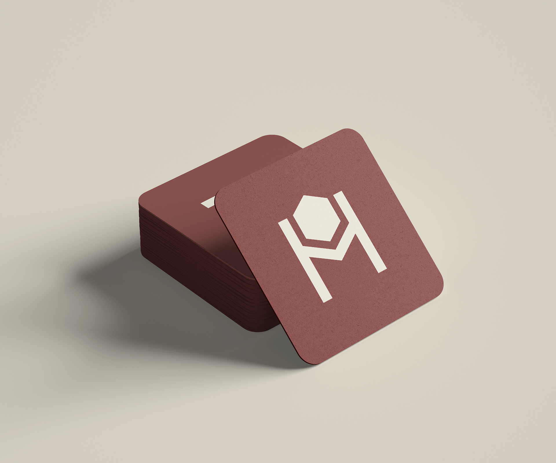
The icon system extends the brand’s geometric and minimal design language, built on structure, clarity, and balance. It includes four main families: destinations, types of vacations and experiences, services and operations, and aviation. At the heart of every icon lies the hexagon - a recurring shape drawn from the logo and inspired by the honeycomb. It represents precision and harmony, serving as a unifying element that ensures consistency across the entire visual system.

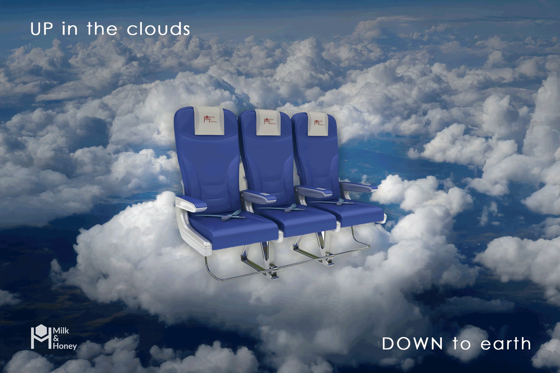
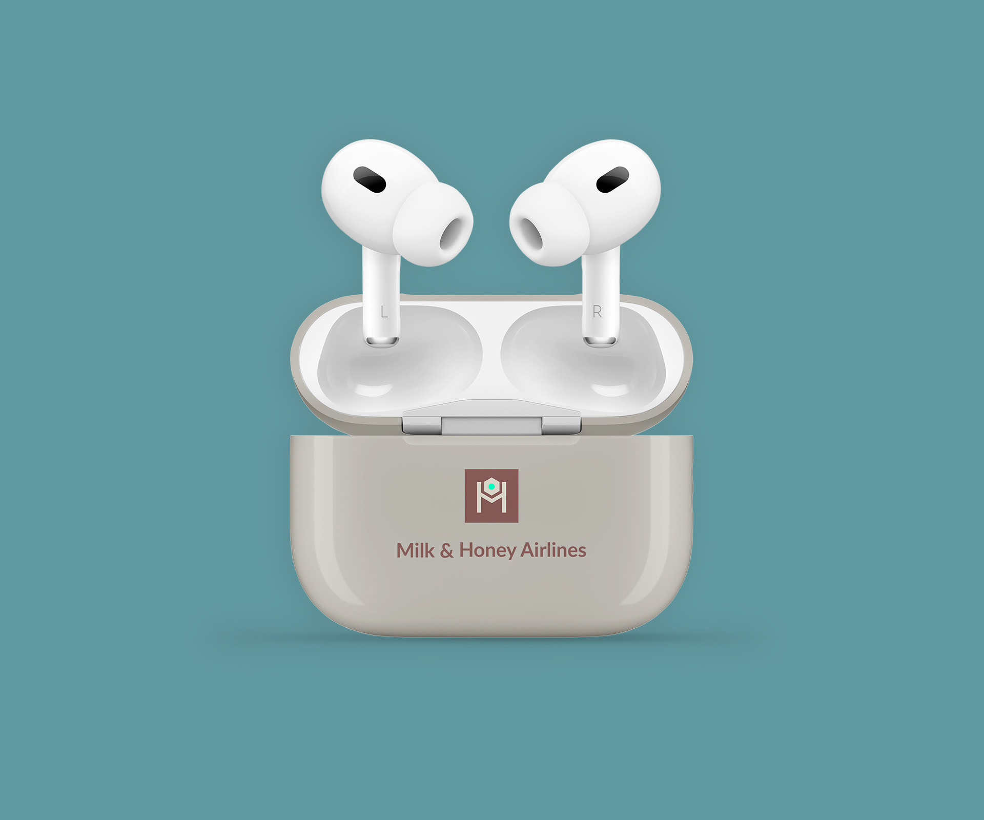
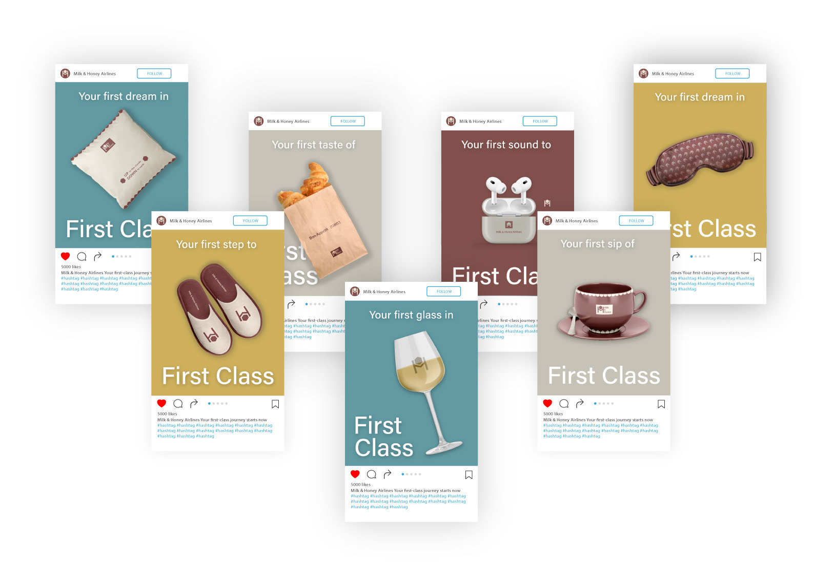
First Class Amenities


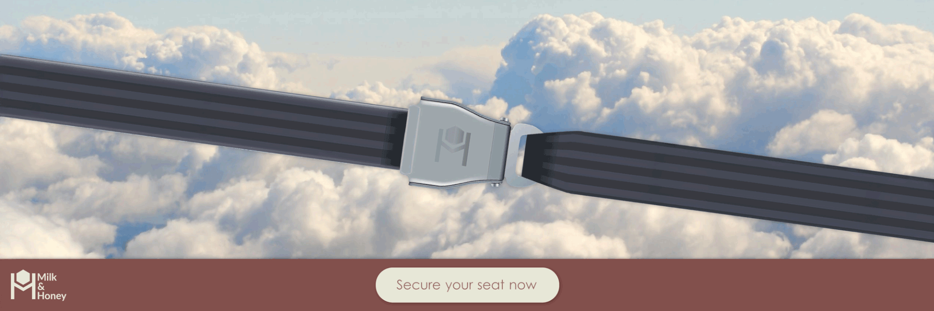
Digital Campaigns
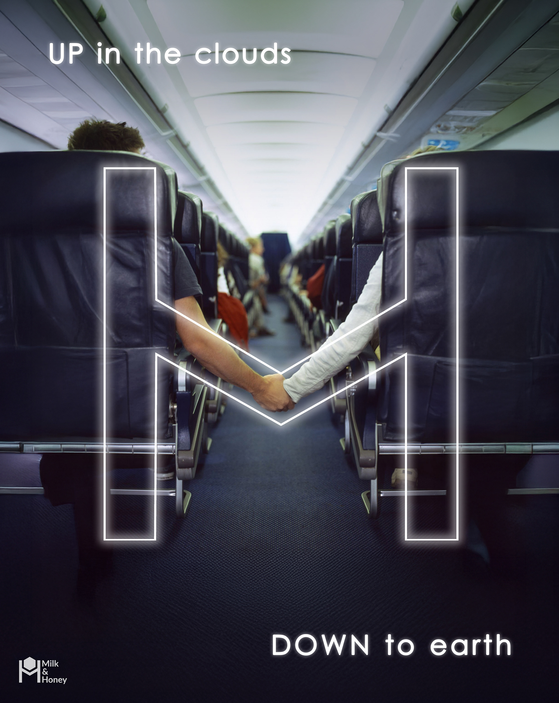
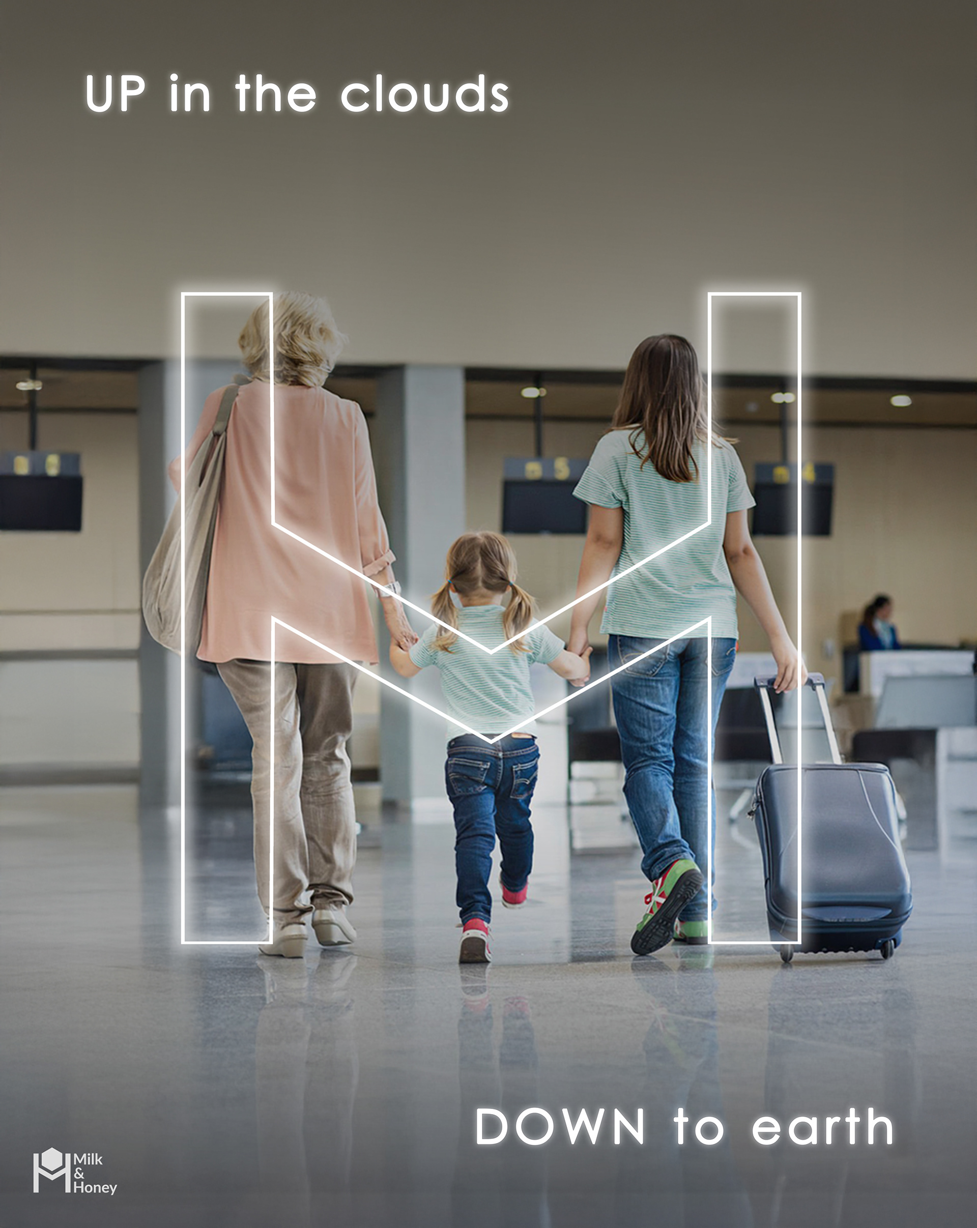


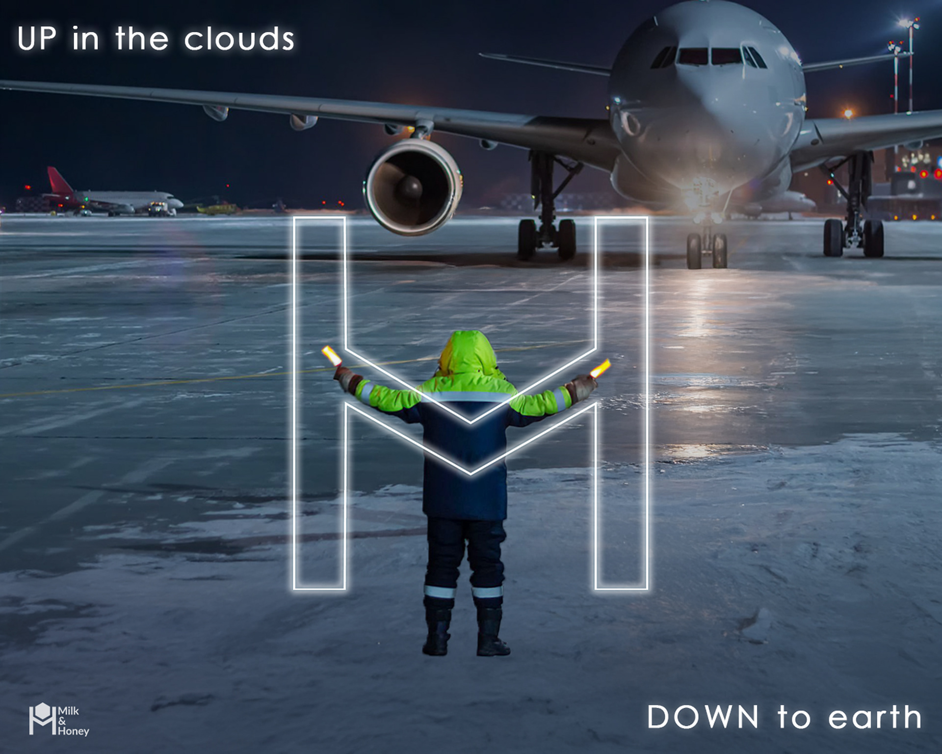
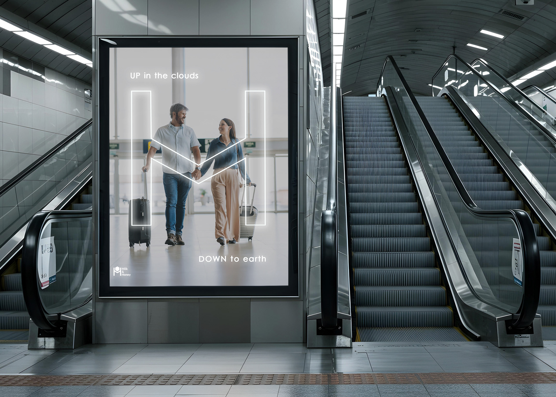
Outdoor Campaigns
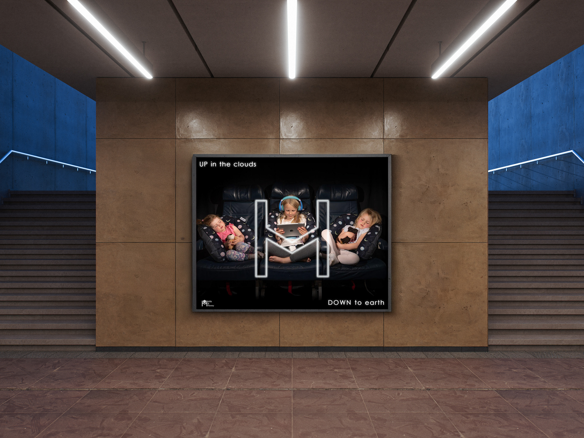
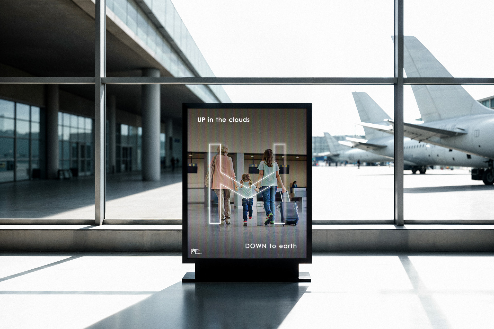
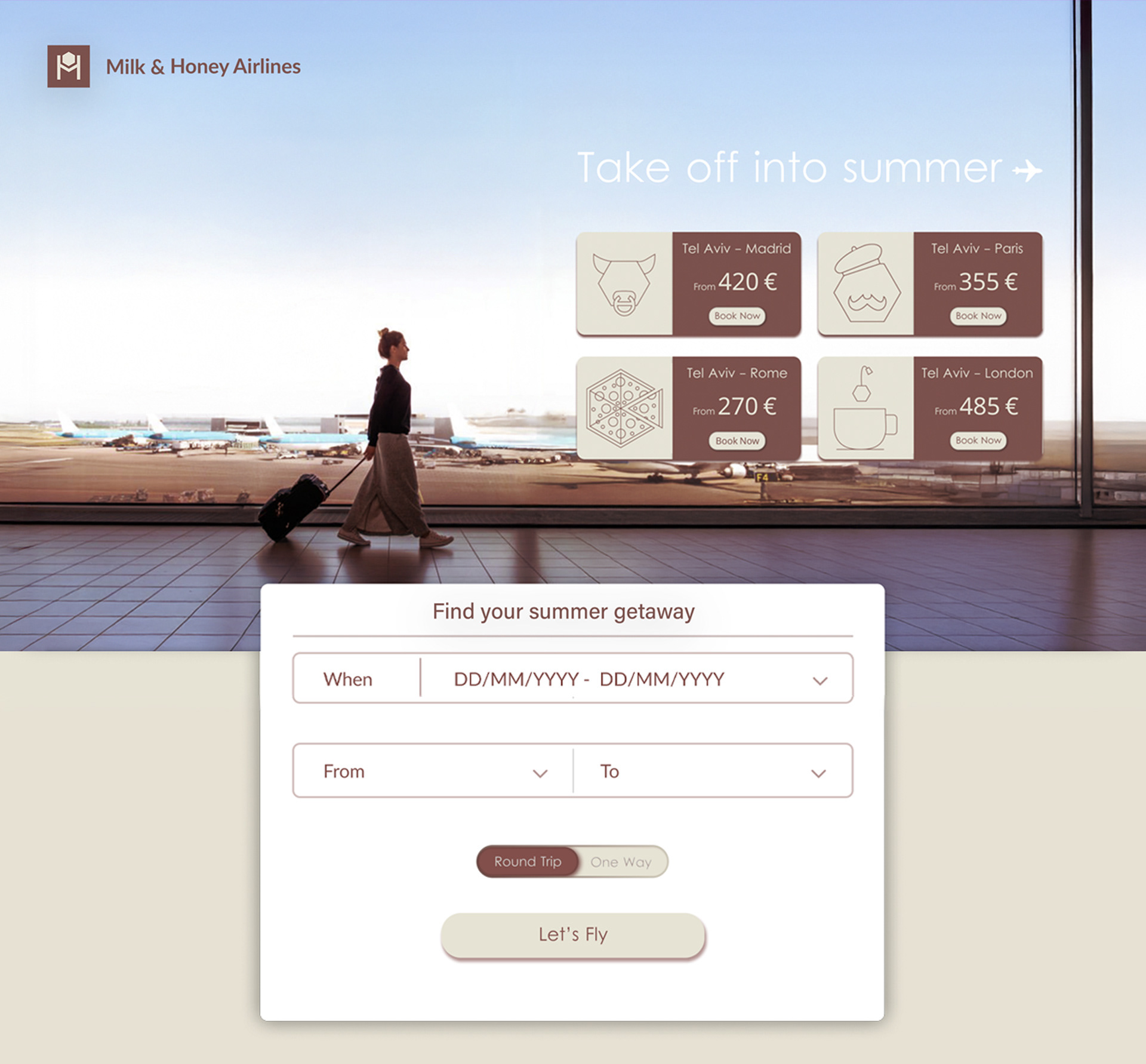
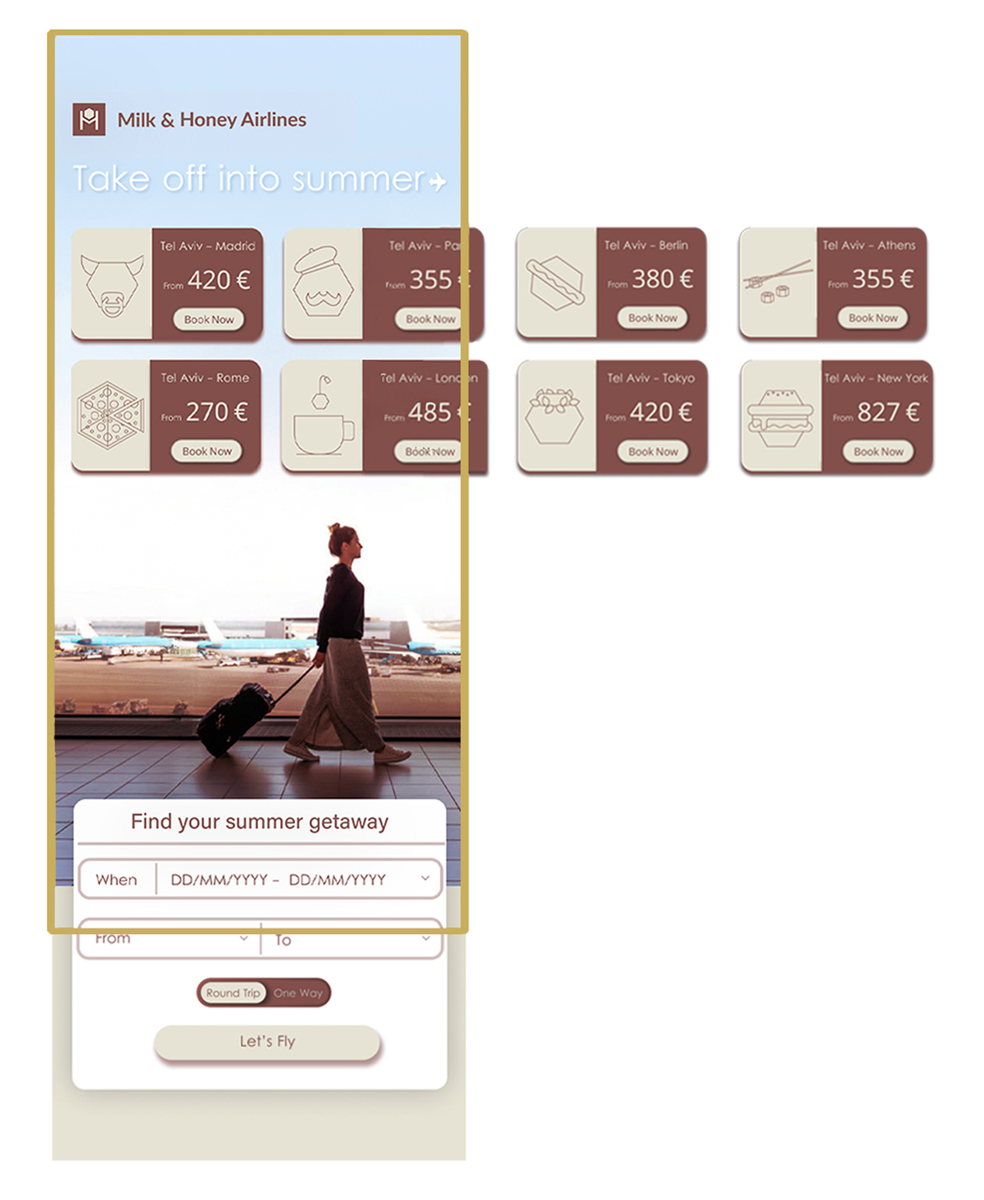
Landing Page
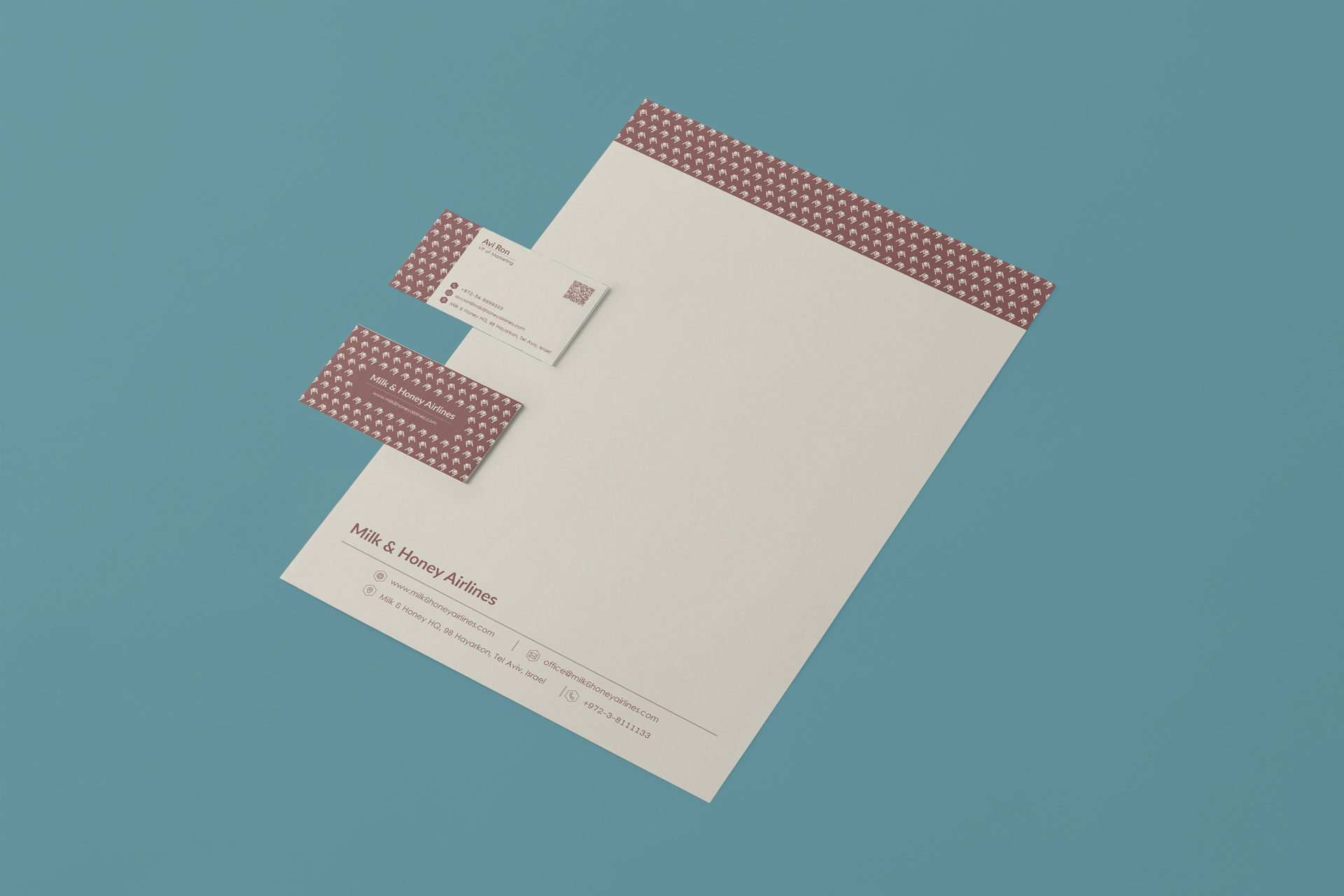
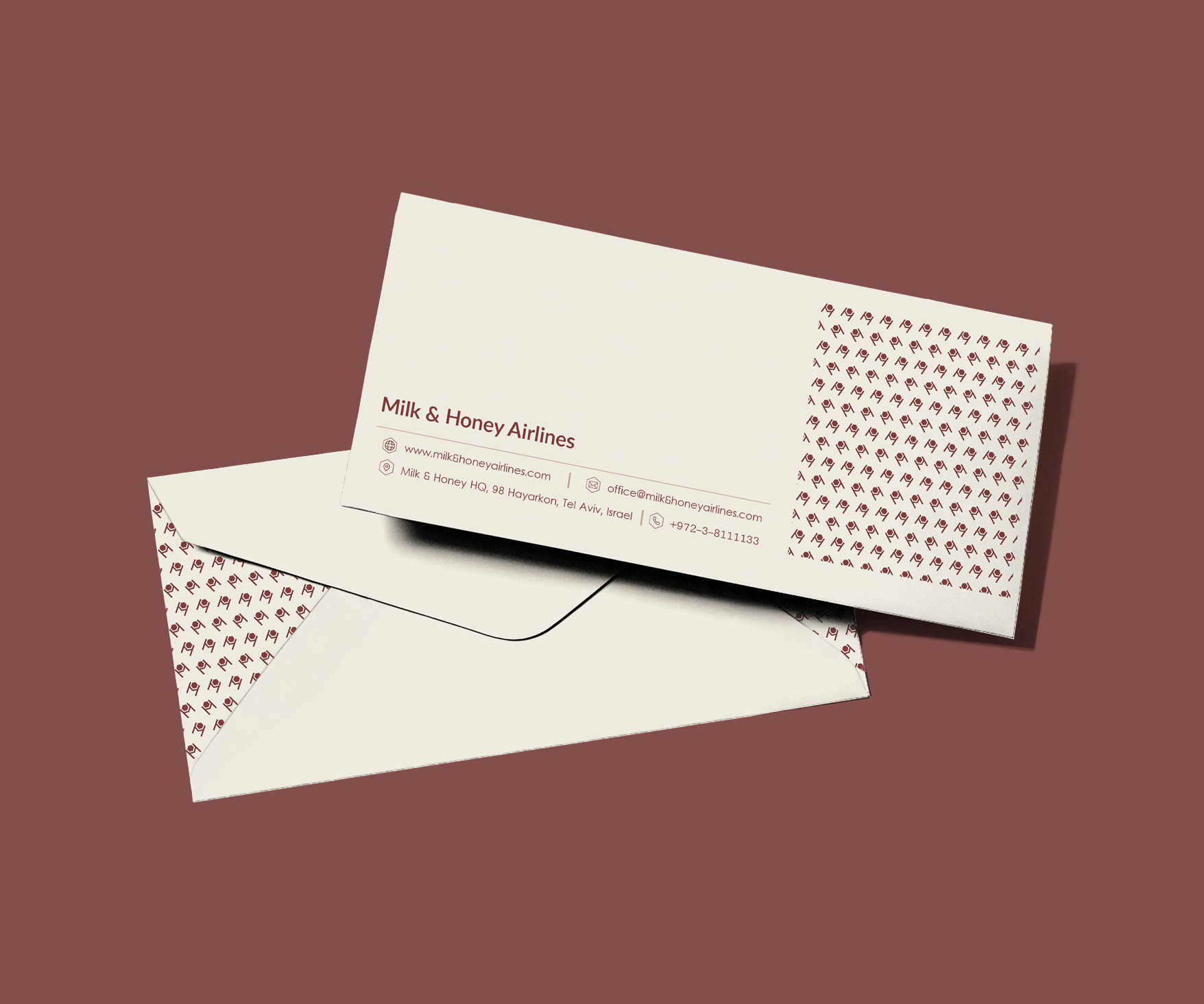
Print Collateral